-
React Website 만들기) 5.Footer부분 만들기REACT 2021. 1. 29. 21:00
홈페이지의 맨 아랫부분에 적용될 footer를 만든다.
1. Footer.js
components폴더에 파일 생성한다.
import React from 'react'
import { Link } from 'react-router-dom';
import {Button} from './Button';
import './Footer.css';

function Footer() {
    return (
        <div className='footer-container'>
            <section className="footer-subscription">
                <p className="footer-subscription-heading">
                    Join the Adventure newsletter to receive our best vacation deals
                </p>
                <p className="footer-subscription-text">
                    You can unsubscribe at any time.
                </p>
                <div className="input-areas">
                    <form>
                        <input type="email" name = "email" placeholder = "Your Email"
                        className="footer-input"/>
                        <Button buttonStyle = 'btn--outline'>Subscribe</Button>
                    </form>
                </div>
            </section>
            <div class='footer-links'>
                <div className='footer-link-wrapper'>
                    <div class='footer-link-items'>
                        <h2>About Us</h2>
                        <Link to='/sign-up'>How it works</Link>
                        <Link to='/'>Testimonials</Link>
                        <Link to='/'>Careers</Link>
                        <Link to='/'>Investors</Link>
                        <Link to='/'>Terms of Service</Link>
                    </div>
                    <div class='footer-link-items'>
                        <h2>Contact Us</h2>
                        <Link to='/'>Contact</Link>
                        <Link to='/'>Support</Link>
                        <Link to='/'>Destinations</Link>
                        <Link to='/'>Sponsorships</Link>
                    </div>
                    </div>
                    <div className='footer-link-wrapper'>
                    <div class='footer-link-items'>
                        <h2>Videos</h2>
                        <Link to='/'>Submit Video</Link>
                        <Link to='/'>Ambassadors</Link>
                        <Link to='/'>Agency</Link>
                        <Link to='/'>Influencer</Link>
                    </div>
                    <div class='footer-link-items'>
                        <h2>Social Media</h2>
                        <Link to='/'>Instagram</Link>
                        <Link to='/'>Facebook</Link>
                        <Link to='/'>Youtube</Link>
                        <Link to='/'>Twitter</Link>
                    </div>
                </div>
            </div>
            <section className="social-media">
                <div className="social-media-wrap">
                    <div className="footer-logo">
                        <Link to='/' className="social-logo">
                            TRVL <i className="fab fa-typo3"></i>
                        </Link>
                    </div>
                    <small className="website-rights">TRVL © 2020</small>
                    <div className="social-icons">
                        <Link className="social-icon-link facebook" to="/"
                        target = "_blank"
                        aria-label="Facebook"
                        >
                            <i className="fab fa-facebook-f"></i>
                        </Link>
                        <Link className="social-icon-link instagram" to="/"
                        target = "_blank"
                        aria-label="Instagram"
                        >
                            <i className="fab fa-instagram"></i>
                        </Link>
                        <Link class='social-icon-link youtube'
                        to='/'
                        target='_blank'
                        aria-label='Youtube'
                        >
                        <i class='fab fa-youtube' />
                        </Link>
                        <Link
                        class='social-icon-link twitter'
                        to='/'
                        target='_blank'
                        aria-label='Twitter'
                        >
                        <i class='fab fa-twitter' />
                        </Link>
                        <Link
                        class='social-icon-link twitter'
                        to='/'
                        target='_blank'
                        aria-label='LinkedIn'
                        >
                        <i class='fab fa-linkedin' />
                        </Link>
                    </div>
                </div>
            </section>
        </div>
    )
}

export default Footer
2. Footer.css
js파일과 같은 폴더 안에 생성.
.footer-container {
    background-color: #242424;
    padding: 4rem 0 2rem 0;
    display: flex;
    flex-direction: column;
    justify-content: center;
    align-items: center;
}

.footer-subscription {
    display: flex;
    flex-direction: column;
    justify-content: center;
    align-items: center;
    text-align: center;
    margin-bottom: 24px;
    padding: 24px;
    color: white;
}

.footer-subscription > p {
    font-family: 'Trebuchet MS', 'Lucida Sans Unicode', 'Lucida Grande', 'Lucida Sans', Arial, sans-serif;

}

.footer-subscription-heading {
    margin-bottom: 24px;
    font-size: 24px;

}

.footer-subscription-text {
    margin-bottom: 24px;
    font-size: 20px;

}

.footer-input {
    padding: 8px 20px;
    border-radius: 2px;
    margin-right: 10px;
    outline: none;
    border: none;
    font-size: 18px;
    margin-bottom: 16px;
    border: 1px solid #fff;
}

.footer-links {
    width: 100%;
    max-width: 1000px;
    display: flex;
    justify-content: center;
}

.footer-link-wrapper {
    display: flex;

}

.footer-link-items {
    display: flex;
    flex-direction: column;
    align-items: flex-start;
    margin: 16px;
    text-align: left;
    width: 160px;
    box-sizing: border-box;
}

.footer-link-items h2 {
    margin-bottom: 16px;

}

.footer-link-items >h2 {
    color: #fff;

}
.footer-link-items a{
    color: #fff;
    text-decoration: none;
    margin-bottom: 8px;
}

.footer-link-items a:hover{
    color: #e9e9e9;
    transition: 0.3s ease-out;
}

.footer-email-form h2 {
    margin-bottom: 32px;
}

.footer-input::placeholder {
    color:#b1b1b1;

}

/* Social Icons */
.social-icon-link {
    color :#fff;
    font-size: 24px;

}

.social-media {
    max-width: 1000px;
    width: 100%;
}

.social-media-wrap {
    display: flex;
    justify-content: space-between;
    align-items: center;
    width: 90%;
    max-width: 1000px;
    margin:40px auto 0 auto;


}

.social-icons {
    display: flex;
    justify-content: space-between;
    align-items: center;
    width: 240px;
}

.social-logo {
    color:#fff;
    justify-self:start;
    margin-left: 20px;
    cursor: pointer;
    text-decoration: none;
    font-size: 2rem;
    align-self: center;
    margin-bottom: 16px;
}

.website-rights {
    color:#fff;
    margin-bottom: 16px;

}

@media screen and (max-width:820px) {
    .footer-links {
        padding-top: 2rem;

    }

    .footer-input {
        width: 100%;

    }
    .btn {
        width: 100%;
    }
    .footer-link-wrapper {
        flex-direction: column;
    }

    .social-media-wrap {
        flex-direction: column;

    }
}
사진으로 보면,
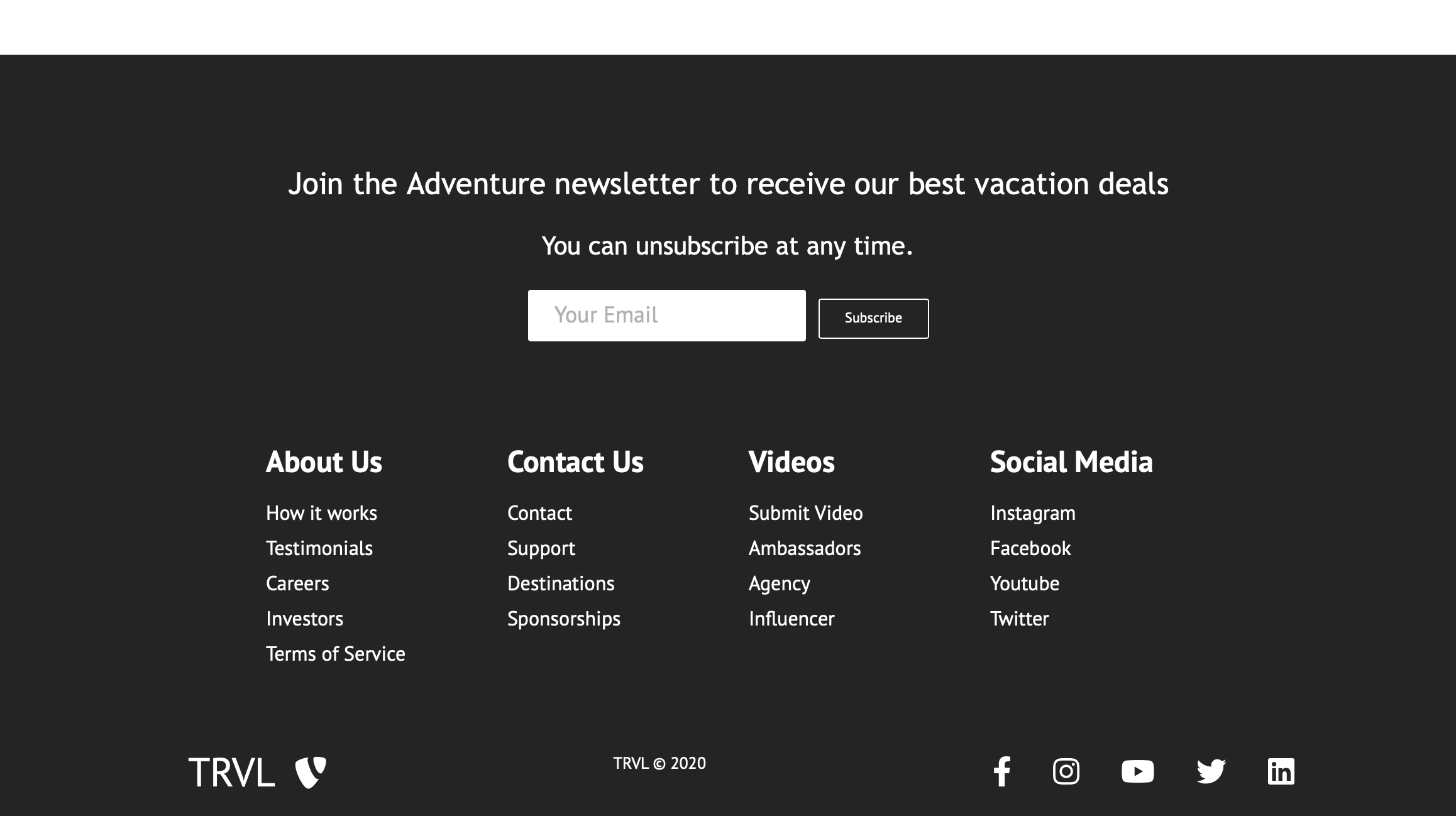
웹사이트 사이즈에서는 일렬로 구현이 된다. 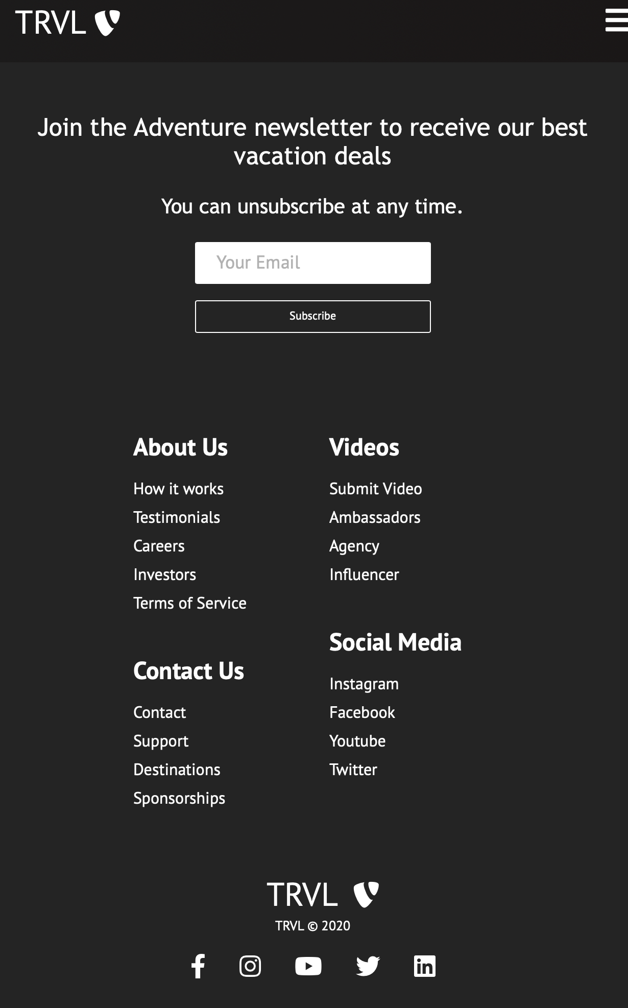
폰사이즈에서는 2개씩 나열이 된다. 'REACT' 카테고리의 다른 글
FormData에 하나의 이름에 multipartFile여러개를 추가하고 싶을 때 (0) 2021.10.26 Facebook 만들기) 1.기본적인 설정과 Header부분 만들기 (0) 2021.02.13 React Website 만들기) 4.Home에 적용할 부분 만들기 (0) 2021.01.29 React Website 만들기) 3.Card부분 만들기 (0) 2021.01.29 React Website 만들기) 2.Home.js만들고 Herosection 만들기 (2) 2021.01.29