-
React Website 만들기) 1.Navbar, Button 만들기REACT 2021. 1. 27. 21:55
리액트 프로젝트는 처음이라 😅
따라하기 시작!
https://www.youtube.com/watch?v=I2UBjN5ER4s&t=411s
아이콘이나 다운받을 자료들은 영상에 자세히 나와있다.
fontAwesome CDN은 여기서서 바로 복사해서 적용할 수 있다!
https://fontawesome.com/how-to-use/customizing-wordpress/snippets/setup-cdn-webfont
Font Awesome
The world’s most popular and easiest to use icon set just got an upgrade. More icons. More styles. More Options.
fontawesome.com
1.index.html
구글 폰트와 fontawesome CDN을 적용했다.
<!DOCTYPE html>
<html lang="en">
  <head>
    <meta charset="utf-8" />
    <link rel="icon" href="%PUBLIC_URL%/favicon.ico" />
    <meta name="viewport" content="width=device-width, initial-scale=1" />
    <meta name="theme-color" content="#000000" />
    <meta
      name="description"
      content="Web site created using create-react-app"
    />
    <link rel="apple-touch-icon" href="%PUBLIC_URL%/logo192.png" />
    <link rel="stylesheet" href="https://pro.fontawesome.com/releases/v5.10.0/css/all.css" integrity="sha384-AYmEC3Yw5cVb3ZcuHtOA93w35dYTsvhLPVnYs9eStHfGJvOvKxVfELGroGkvsg+p" crossorigin="anonymous"/>
    <link
      href="https://fonts.googleapis.com/css2?family=PT+Sans:wght@700&display=swap"
      rel="stylesheet"
    />
    <!--
      manifest.json provides metadata used when your web app is installed on a
      user's mobile device or desktop. See https://developers.google.com/web/fundamentals/web-app-manifest/
    -->
    <link rel="manifest" href="%PUBLIC_URL%/manifest.json" />
    <!--
      Notice the use of %PUBLIC_URL% in the tags above.
      It will be replaced with the URL of the `public` folder during the build.
      Only files inside the `public` folder can be referenced from the HTML.

      Unlike "/favicon.ico" or "favicon.ico", "%PUBLIC_URL%/favicon.ico" will
      work correctly both with client-side routing and a non-root public URL.
      Learn how to configure a non-root public URL by running `npm run build`.
    -->
    <title>React App</title>
  </head>
  <body>
    <noscript>You need to enable JavaScript to run this app.</noscript>
    <div id="root"></div>
    <!--
      This HTML file is a template.
      If you open it directly in the browser, you will see an empty page.

      You can add webfonts, meta tags, or analytics to this file.
      The build step will place the bundled scripts into the <body> tag.

      To begin the development, run `npm start` or `yarn start`.
      To create a production bundle, use `npm run build` or `yarn build`.
    -->
  </body>
</html>
2. index.js
import React from 'react';
import ReactDOM from 'react-dom';
import App from './App';

ReactDOM.render(<App />, document.getElementById('root')
);
3.App.css
이 부분은 영상에 나와있는대로 자료에서 복사 붙여넣기!
* {
    box-sizing: border-box;
    margin: 0;
    padding: 0;
    font-family: 'PT Sans', sans-serif;
  }

  .home,
  .services,
  .products,
  .sign-up {
    display: flex;
    height: 90vh;
    align-items: center;
    justify-content: center;
    font-size: 3rem;
  }

  .services {
    background-image: url('/src/images/img-2.jpg');
    background-position: center;
    background-size: cover;
    background-repeat: no-repeat;
    color: #fff;
    font-size: 100px;
  }

  .products {
    background-image: url('/src/images/img-1.jpg');
    background-position: center;
    background-size: fill;
    background-repeat: no-repeat;
    color: #fff;
    font-size: 100px;
  }

  .sign-up {
    background-image: url('/src/images/img-8.jpg');
    background-position: center;
    background-size: cover;
    background-repeat: no-repeat;
    color: #fff;
    font-size: 100px;
  }
4.App.js
리액트 1도 몰라서 그냥 따라쓰기 했다😅
import React from 'react';
import './App.css';
import Navbar from'./components/Navbar';
import {BrowserRouter as Router, Switch, Route} from 'react-router-dom';

function App() {
  return (
    <>
    <Router>
      <Navbar />
      <Switch>
        <Route path='/' exact />
      </Switch>
    </Router>
    </>
  );
}

export default App;
5.Button.css
:root {
    --primary: #fff;
}

.btn{
    padding: 8px 20px;
    border-radius: 2px;
    outline: none;
    border: none;
    cursor: pointer;
}

.btn--primary{
    background-color: var(--primary);
    color: #242424;
    border: 1px solid var(--primary);
}

.btn--outline {
    background-color: transparent;
    color: white;
    padding:8px 20px;
    border: 1px solid var(--primary);
    transition: all 0.3s ease-out;
}

.btn-medium {
    padding: 8px 20px;
    font-size: 20px;

}

.btn--large {
    padding: 12px 26px;
    font-size: 20px;

}


.btn--medium:hover,
.btn--large:hover{
    background: white;
    color: #242424;
    transition: all 0.3s ease-out;

}
6. Button.js
버튼 작동을 설정하는 javascript.
버튼의 사이즈와 스타일을 지정하고 입력값에 따라서 알맞은 내용의 버튼 출력을 한다.
import React from 'react';
import './Button.css';
import {Link} from 'react-router-dom';

const STYLES = ['btn--primary', 'btn--outline'];

const SIZES = ['btn--medium', 'btn--large'];

export const Button = ({children, type, onClick, buttonStyle, buttonSize}) => {
    // buttonstyle이 따로 지정되지 않으면 가장 기본인 배열의 0번째가 설정된다.
    const checkButtonStyle = STYLES.includes(buttonStyle) ? buttonStyle : STYLES[0];
    // buttonsize가 지정되지 않으면 가장 기본 사이즈인 0번재 btn-medium이 설정된다.
    const checkButtonSize = SIZES.includes(buttonSize) ? buttonSize : SIZES[0];

    return (
        // children안에 어떤 내용을 입력해도 버튼 이름이 된다.
        <Link to = '/sign-up' className = 'btn-mobile'>
            <button
            className={`btn ${checkButtonStyle} ${checkButtonSize}`}
            onClick={onClick}
            type={type}
            >
                {children}
            </button>
        </Link>
    );

};
7. Navbar.css
영상 자료에 따라서 복사 붙여넣기
.navbar {
    background: linear-gradient(90deg, rgb(28, 27, 27) 0%, rgb(26, 23, 23) 100%);
    height: 80px;
    display: flex;
    justify-content: center;
    align-items: center;
    font-size: 1.2rem;
    position: sticky;
    top: 0;
    z-index: 999;
  }

  .navbar-container {
    display: flex;
    justify-content: center;
    align-items: center;
    height: 80px;
    max-width: 1500px;
  }

  .navbar-logo {
    color: #fff;
    justify-self: start;
    margin-left: 20px;
    cursor: pointer;
    text-decoration: none;
    font-size: 2rem;
    display: flex;
    align-items: center;
  }

  .fa-typo3 {
    margin-left: 0.5rem;
    font-size: 1.8rem;
  }

  .nav-menu {
    display: grid;
    grid-template-columns: repeat(4, auto);
    grid-gap: 10px;
    list-style: none;
    text-align: center;
    width: 60vw;
    justify-content: end;
    margin-right: 2rem;
  }

  .nav-item {
    height: 80px;
  }

  .nav-links {
    color: #fff;
    display: flex;
    align-items: center;
    text-decoration: none;
    padding: 0.5rem 1rem;
    height: 100%;
  }

  .nav-links:hover {
    border-bottom: 4px solid #fff;
    transition: all 0.2s ease-out;
  }

  .fa-bars {
    color: #fff;
  }

  .nav-links-mobile {
    display: none;
  }

  .menu-icon {
    display: none;
  }

  @media screen and (max-width: 960px) {
    .NavbarItems {
      position: relative;
    }

    .nav-menu {
      display: flex;
      flex-direction: column;
      width: 100%;
      height: 90vh;
      position: absolute;
      top: 80px;
      left: -100%;
      opacity: 1;
      transition: all 0.5s ease;
    }

    .nav-menu.active {
      background: #242222;
      left: 0;
      opacity: 1;
      transition: all 0.5s ease;
      z-index: 1;
    }

    .nav-links {
      text-align: center;
      padding: 2rem;
      width: 100%;
      display: table;
    }

    .nav-links:hover {
      background-color: #fff;
      color: #242424;
      border-radius: 0;
    }

    .navbar-logo {
      position: absolute;
      top: 0;
      left: 0;
      transform: translate(25%, 50%);
    }

    .menu-icon {
      display: block;
      position: absolute;
      top: 0;
      right: 0;
      transform: translate(-100%, 60%);
      font-size: 1.8rem;
      cursor: pointer;
    }

    .fa-times {
      color: #fff;
      font-size: 2rem;
    }

    .nav-links-mobile {
      display: block;
      text-align: center;
      margin: 2rem auto;
      border-radius: 4px;
      width: 80%;
      text-decoration: none;
      font-size: 1.5rem;
      background-color: transparent;
      color: #fff;
      padding: 14px 20px;
      border: 1px solid #fff;
      transition: all 0.3s ease-out;
    }

    .nav-links-mobile:hover {
      background: #fff;
      color: #242424;
      transition: 250ms;
    }
  }
8. Navbar.js
화면 크기에 따른 navbar모양이 변하도록 설정한다.
import React, { useState, useEffect} from 'react';
import { Link } from 'react-router-dom';
import {Button} from './Button';
import './Navbar.css';

function Navbar() {
    const [click, setClick] = useState(false);
    const [button, setButton] = useState(true);


    const handleClick = () => setClick(!click) ;
    const closeMobileMenu = () => setClick(false);

    // 화면 크기에 따라서 버튼이 보이고 안보이도록 설정한다.
    const showButton = () => {
        if(window.innerWidth <= 960){
            setButton(false)
        }
        else {
            setButton(true);
        }
    };

    // SIGNUP버튼이 사이즈가 줄어들면 없어지도록 한다.
    useEffect(() => {
        showButton();
    }, []);


    window.addEventListener('resize', showButton);

    return (
        <>
        <nav className = 'navbar'>
            <div className = 'navbar-container'>
                {/* 모바일버전에서 클릭하면 메뉴 보이도록 설정하는 것도 한다. (close Mobile Menu)는 다시 버튼 누르면 없어지고 생기고 하도록 한다.  */}
                <Link to='/' className='navbar-logo' onClick={closeMobileMenu}>
                    TRVL
                    <i className='fab fa-typo3' />
                </Link>
                <div className='menu-icon' onClick={handleClick}>
                    <i className = {click ? 'fas fa-times' : 'fas fa-bars' } />
                </div>
                <ul className={click ? 'nav-menu active' : 'nav-menu'}>
                    <li className='nav-item'>
                        <Link to='/' className='nav-links' onClick = {closeMobileMenu}>
                            Home
                        </Link>
                    </li>
                    <li className='nav-item'>
                        <Link to='/services' className='nav-links' onClick = {closeMobileMenu}>
                            Services
                        </Link>
                    </li>
                    <li className='nav-item'>
                        <Link to='/products' className='nav-links' onClick = {closeMobileMenu}>
                            Products
                        </Link>
                    </li>
                    <li className='nav-item'>
                        <Link to='/sign-up' className='nav-links-mobile' onClick = {closeMobileMenu}>
                            Sign Up
                        </Link>
                    </li>
                </ul>
                {button && <Button buttonStyle='btn--outline'>SIGN UP</Button>}
            </div>
        </nav>
        </>
    );
}

export default Navbar
사진으로 보면,
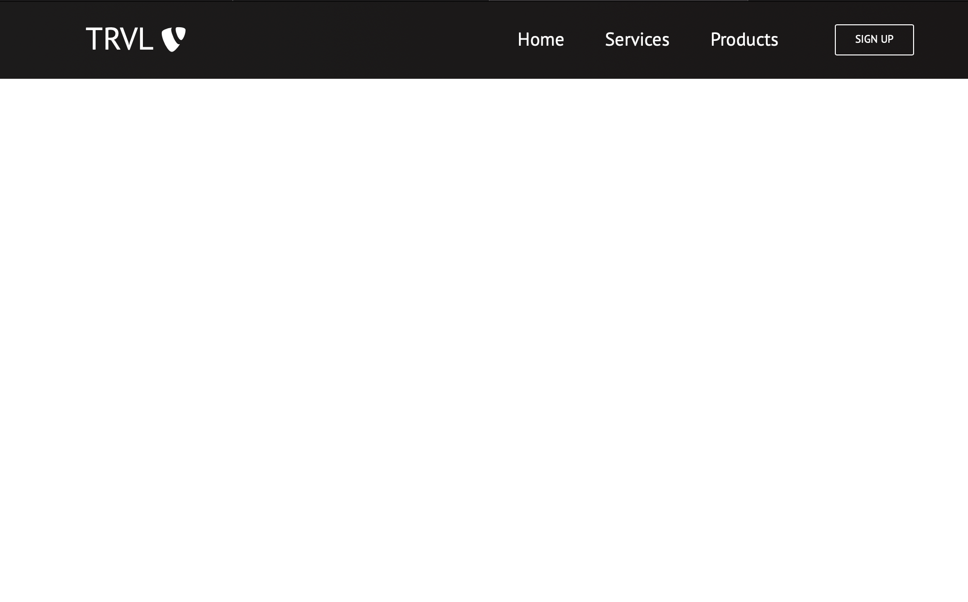
960이상일때 기본 페이지 

사이즈가 줄어들면 탐색바가 바뀌고 버튼을 누름에 따라서 메뉴가 나오고 사라진다. 'REACT' 카테고리의 다른 글
Facebook 만들기) 1.기본적인 설정과 Header부분 만들기 (0) 2021.02.13 React Website 만들기) 5.Footer부분 만들기 (0) 2021.01.29 React Website 만들기) 4.Home에 적용할 부분 만들기 (0) 2021.01.29 React Website 만들기) 3.Card부분 만들기 (0) 2021.01.29 React Website 만들기) 2.Home.js만들고 Herosection 만들기 (2) 2021.01.29